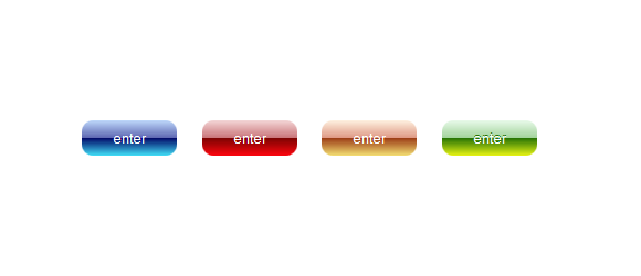
Всем привет! Когда-то я была дизайнером и мне на глаза часто попадались векторные исходники с красивыми кнопками — стеклянными, глянцевыми, сияющими. Но в HTML странице далеко не всегда можно было использовать такие кнопки, только если вставлять ее как картинку полностью или составлять из нескольких частей картинки. Пока не появился CSS3.
Немного поэкспериментировав на досуге с CSS3 и псевдо-элементами, я получила те самые кнопочки, которые так часто встречаются в векторе и очень редко в web.
Я сделала небольшую библиотеку кнопок, здесь опишу лишь часть.
Для классов css я буду использовать префикс inox_.
Начну с самых простых.
Пример приведу для синей кнопочки, по примеру можно сделать кнопку любого цвета.
В этом примере я буду использовать псевдо-элемент :before. Приведу пример для зеленой кнопочки.
Здесь и далее используется градиент псевдо-элемента с разной прозрачностью.
Теперь такие же, но с полосатым фоном (пример серой кнопочки.):

Вариант стеклянной кнопки с бордером и подсветкой внизу. Пример голубой кнопочки.

И, напоследок, круглые сияющие кнопки. Пример синей кнопки.

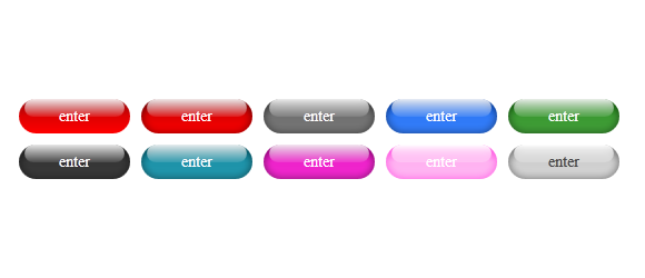
Немного поэкспериментировав на досуге с CSS3 и псевдо-элементами, я получила те самые кнопочки, которые так часто встречаются в векторе и очень редко в web.
Я сделала небольшую библиотеку кнопок, здесь опишу лишь часть.
Для классов css я буду использовать префикс inox_.
Начну с самых простых.
Пример 1

Разметка
<input type="button" class="inox_gloss_blue" value="enter">
Стили
Пример приведу для синей кнопочки, по примеру можно сделать кнопку любого цвета.
.inox_gloss_blue {
    color:#fff;
    background-color:blue;
    background-image: -moz-linear-gradient(#bdd7fa, #5d66b1 50%, #010767 20%, #40def7);
    background-image: -webkit-linear-gradient(#bdd7fa, #5d66b1 50%, #010767 20%, #40def7);
    background-image: -o-linear-gradient(#bdd7fa, #5d66b1 50%, #010767 20%, #40def7);
    border:0px;
    border-radius:10px;
    padding:7px 25px;
}
.inox_gloss_blue:hover {
    background-image: -moz-linear-gradient(#bad4f8, #b2b7da 50%, #8b90bb 50%, #3ed8f3);
    background-image: -webkit-linear-gradient(#bad4f8, #b2b7da 50%, #8b90bb 50%, #3ed8f3);
    background-image: -o-linear-gradient(#bad4f8, #b2b7da 50%, #8b90bb 50%, #3ed8f3);
}
Пример 2

В этом примере я буду использовать псевдо-элемент :before. Приведу пример для зеленой кнопочки.
Разметка
<a class="inox_glass_green" href="#">enter</a>
Стили
.inox_glass_green {
    color:#fff;
    line-height: 32px;
    border: 0px;
    text-align: center;
    width: 100px;
    border-radius:16px;
    background:transparent;
    background-image: -webkit-linear-gradient(#127009, #3b9932, #409e37);
    background-image: -moz-linear-gradient(#127009, #3b9932, #409e37);
    background-image: -o-linear-gradient(#127009, #3b9932, #409e37);
    -moz-box-shadow: inset 0 0 7px rgba(0,0,0,0.5);
    -webkit-box-shadow: inset 0 0 7px rgba(0,0,0,0.5);
    -o-box-shadow: inset 0 0 7px rgba(0,0,0,0.5);
    box-shadow: inset 0 0 7px rgba(0,0,0,0.5);
    display: block;
    text-decoration: none;
    font-size: 14px;
    padding: 0px;
}
.inox_glass_green:before {
    content: ".";
    color:transparent;
    line-height: 16px;
    width: 90px;
    margin-top: 0px;
    margin-bottom: -17px;
    margin-left: 5px;
    background-image: -webkit-linear-gradient(rgba(255, 255, 255, 0.9), rgba(255, 255, 255, 0.1) );
    background-image:-moz-linear-gradient(rgba(255, 255, 255, 0.9), rgba(255, 255, 255, 0.1));
    background-image: -o-linear-gradient(rgba(255, 255, 255, 0.9), rgba(255, 255, 255, 0.1));
    border-radius:16px;
    display:block;
}
Здесь и далее используется градиент псевдо-элемента с разной прозрачностью.
Пример 3
Теперь такие же, но с полосатым фоном (пример серой кнопочки.):

Разметка
<a class="inox_darkgrey inox_glass_streak" href="#">enter</a>
Стили
.inox_darkgrey {
    background-color: #727272;
}
.inox_glass_streak {
    color:#fff;
    line-height: 32px;
    border: 0px;
    text-align: center;
    width: 100px;
    border-radius:16px;
    background-image: -webkit-linear-gradient(-45deg, rgba(255, 255, 255, 0.2) 25%, transparent 25%, transparent 50%, rgba(255, 255, 255, 0.2) 50%, rgba(255, 255, 255, 0.2) 75%, transparent 75%, transparent);
    background-image: -moz-linear-gradient(-45deg, rgba(255, 255, 255, 0.2) 25%, transparent 25%, transparent 50%, rgba(255, 255, 255, 0.2) 50%, rgba(255, 255, 255, 0.2) 75%, transparent 75%, transparent);
    background-image: -o-linear-gradient(-45deg, rgba(255, 255, 255, 0.2) 25%, transparent 25%, transparent 50%, rgba(255, 255, 255, 0.2) 50%, rgba(255, 255, 255, 0.2) 75%, transparent 75%, transparent);
    -webkit-background-size: 12px 12px;
    -moz-background-size: 12px 12px;
    background-size: 12px 12px;
    -moz-box-shadow: inset 0 0 7px rgba(0,0,0,0.5);
    -webkit-box-shadow: inset 0 0 7px rgba(0,0,0,0.5);
    -o-box-shadow: inset 0 0 7px rgba(0,0,0,0.5);
    box-shadow: inset 0 0 7px rgba(0,0,0,0.5);
    display: block;
    text-decoration: none;
    font-size: 14px;
    padding: 0px;
}
.inox_glass_streak:before {
    content: ".";
    color:transparent;
    line-height: 16px;
    width: 90px;
    margin-top: 0px;
    margin-bottom: -17px;
    margin-left: 5px;
    background-image: -webkit-linear-gradient(rgba(255, 255, 255, 0.9), rgba(255, 255, 255, 0.1) );
    background-image:-moz-linear-gradient(rgba(255, 255, 255, 0.9), rgba(255, 255, 255, 0.1));
    background-image: -o-linear-gradient(rgba(255, 255, 255, 0.9), rgba(255, 255, 255, 0.1));
    border-radius:16px; display:block;
}
Пример 4
Вариант стеклянной кнопки с бордером и подсветкой внизу. Пример голубой кнопочки.

Разметка
<a class="inox_shining_blue" href="#">enter</a>
Стили
.inox_shining_blue {
    color:#fff;
    line-height: 32px;
    border: 1px solid #054baa;
    text-align: center;
    width: 100px;
    border-radius:16px;
    background:transparent;
    background-image: -webkit-linear-gradient(#0245ad, #01dafb);
    background-image: -moz-linear-gradient(#0245ad, #01dafb);
    background-image: -o-linear-gradient(#0245ad, #01dafb);
    -moz-box-shadow: inset 0px -2px 0 #01fff9;
    -webkit-box-shadow: inset 0px -2px 0 #01fff9;
    -o-box-shadow: inset 0px -2px 0 #01fff9;
    box-shadow: inset 0px -1px 2px #01fff9;
    display: block;
    text-decoration: none;
    font-size: 14px;
    padding: 0px;
}
.inox_shining_blue:before {
    content: ".";
    color:transparent;
    line-height: 16px;
    width: 90px;
    margin-top: 0px;
    margin-bottom: -17px;
    margin-left: 5px;
    background-image: -webkit-linear-gradient(rgba(255, 255, 255, 0.9), rgba(255, 255, 255, 0.2) );
    background-image:-moz-linear-gradient(rgba(255, 255, 255, 0.9), rgba(255, 255, 255, 0.2));
    background-image: -o-linear-gradient(rgba(255, 255, 255, 0.9), rgba(255, 255, 255, 0.2));
    border-radius:16px;
    display:block;
}
Пример 5
И, напоследок, круглые сияющие кнопки. Пример синей кнопки.

Разметка
<a href="#" class="inox_cristal_rd_blue">Go</a>
Стили
.inox_cristal_rd_blue {
    color:#fff;
    line-height: 48px;
    border: 0px;
    text-align: center;
    width: 48px;
    border-radius:24px;
    background:transparent;
    background-image:-moz-radial-gradient(center bottom, circle cover, rgba(16, 236, 236, 1) 20%, rgba(0, 44, 228, 1) 80%);
    background-image:-webkit-radial-gradient(center bottom, circle cover, rgba(16, 236, 236, 1) 20%, rgba(0, 44, 228, 1) 80%);
    background-image:-o-radial-gradient(center bottom, circle cover, rgba(16, 236, 236, 1) 20%, rgba(0, 44, 228, 1) 80%);
    display: block;
    padding: 0px;
    text-decoration: none;
}
.inox_cristal_rd_blue:before {
    content: ".";
    color:transparent;
    line-height: 24px;
    width: 40px;
    margin-left: 4px;
    margin-bottom: -24px;
    background-image: -webkit-linear-gradient(rgba(255, 255, 255, 0.9), rgba(255, 255, 255, 0) );
    background-image:-moz-linear-gradient(rgba(255, 255, 255, 0.9), rgba(255, 255, 255, 0));
    background-image: -o-linear-gradient(rgba(255, 255, 255, 0.9), rgba(255, 255, 255, 0));
    border-radius:24px;
    display:block;
}