Pull to refresh
111.81

Design

Design will save the world

Show first
Rating limit
Level of difficulty

7 tips to make video learning more effective

Level of difficultyEasy
Reading time5 min
Views4.2K

While video-based learning continues to rank high in the latest trends, there are a few points that are regularly overlooked in the production of learning videos, with a focus on user experience (UX) and user interaction 

People really enjoy watching videos. According to a survey conducted among consumers worldwide, respondents watched an average of 19 hours of online video content per week in 2022. And nearly half of all internet users watch online videos at least once a week.

Read more
Rating0
Comments0

Designing for Success: Crafting Effective Learning Experiences

Level of difficultyMedium
Reading time7 min
Views4K

The Challenge of Mandatory Learning
Once we had several mandatory learning courses designed to be passed successfully by all employees. Still, many of them struggled to do so. Reminder emails to all participants could not solve the issue. And that is when my team was summoned to develop a thorough plan to reduce the number of overdue courses to a minimum. Of course, we were asked to develop something fun and engaging.

Uncovering the Root Problems
While working on the project, we managed to uncover several problems with course assignments, including the fact that they were not offered just in time, there were too many of them, and all of them had different due dates, which made it impossible to remember when to complete them. Additionally, we found that the content itself was often dry and unengaging, further contributing to the lack of motivation among employees. Finally, we came up with a system of notifications that included clear explanatory reminder emails, an escalation system, and a redesign of the course content to make it more interactive and relevant to employees' daily work. The result was almost no overdue courses after system integration.

The Myth of Mandatory Fun
So the case first seemed to be about motivation and engagement, but it is actually about smart course design that allows people to worry about work tasks instead of worrying about course assignments. It's also about creating content that resonates with the learners and helps them see the value in the training.

Read more
Rating0
Comments0

Architecture Decision Records (ADR): Enhancing Software Development

Level of difficultyEasy
Reading time3 min
Views1.3K

Introduction to ADRs

ADRs are critical for documenting architectural decisions in software projects. They provide a historical record of decisions, rationales, and impacts, vital for future teams and stakeholders.

Defining ADRs

An ADR is a document capturing key architectural decisions along with their context and consequences. It helps stakeholders understand why certain choices were made during a project, promoting transparency and clarity.

Read more
Rating0
Comments0

The mystery of Telegram

Level of difficultyEasy
Reading time12 min
Views1.9K

This article was originally posted at Product Identity.

What comes to your mind when you hear the word Telegram?

I wouldn’t be surprised if drugs, sex, or crypto are your first associations. Throughout the years, Telegram earned a shady reputation, perhaps not strategically, but for a “good” reason.

I feel like Telegram is a mystery. On the outside, it might be perceived as a platform designed for drug traffickers, crypto scammers, and sexual abusers.

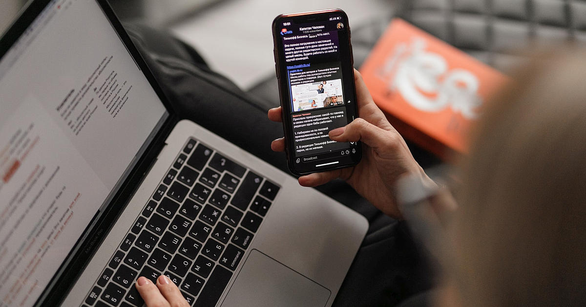
I shared this feeling when I joined the early team of Bancor in 2016, as I also joined its internal group chat, needless to say, on Telegram.

However, the app was quickly removed from my list of stigmas. Instead, I started to appreciate Telegram for its well-crafted product and care for design. From its meticulous attention to small details to have a unique brand — it stands as a dogma of an opinionated product (and a company) in many aspects. In addition, it helped me recognize the benefits of separating my private and professional lives early on.

After using Telegram extensively over the past 7+ years, I feel the urge to write about it, but this time not in the spirit of its typical news headlines.

Read more
Total votes 2: ↑2 and ↓0+2
Comments1

An introduction to the world of AI for designers

Level of difficultyEasy
Reading time5 min
Views1.5K

Every day a new neural network appears and every day more opportunities are opened to designers to simplify their workflow. Someone fundamentally refuses to use them, because “there is no life in machinex and technologies”, and someone is only happy to find a way to reduce the amount of work. Personally, I belong to the second type and want to share the most detailed gait on neurons I have acquired lately. 

Read more
Total votes 1: ↑1 and ↓0+1
Comments0

UX Copy: Writing for Non-Readers

Reading time6 min
Views1.8K

Getting a task from a client, UX designers tend to pay attention to the design goals, not the contents of the website/app itself. There’s something completely wrong with it because the visual part might be superb, but when it frames a vague or wordy message, the client's goals won’t be reached.

To avoid this, a UX designer should dive deeper into the content, analyze it, and restructure it in an interface-friendly way. It doesn’t mean doing the copywriter’s job, it means collaborating. The reality is that sometimes the writing team is used to praising the product (because clients like that), or there is no copywriter involved in the project at all.

Provide proof instead of opinion

An impression is more powerful when the customer can conclude the product’s benefits on their own. Instead of a colorful line of adjectives like “ultimate” or “leading” you should aim at what exactly makes the product that cool. The trick is to be precise, preferably with an example.

Get More Tips
Total votes 5: ↑4 and ↓1+3
Comments6

Designing Converting Landing Pages

Reading time6 min
Views3.8K

It feels like everything about LPs has already been said, however, I still keep seeing the same mistakes being made over and over again both by start-ups and established companies. Here are some tips, backed up by my 10-year experience as a UX/UI Director in agencies and product-led companies. These alone will give a nice increase in your conversion rate, I guarantee. 

Use a descriptive, not a salesy hero header 

Answer the questions “What?” and “For whom?” as early on the page as possible. A very common pattern is the largest copy being an inspirational abstract slogan and below it in smaller font the actual statement about what the product is and what it does. 

Get More Tips
Total votes 6: ↑6 and ↓0+6
Comments11

Four UX failings that e-commerce can fix with design

Reading time3 min
Views915

On average, online store users make 64 clicks before adding a product to the cart. Some clicks are useful - so-called discovery clicks that help lead to users finding a product they wish to buy, and some are useless that come as the result of poor UX. With great competition for convenience and increasingly reducing attention spans of users, each useless click reduces the number of visitors that will reach checkout.

Read more
Rating0
Comments2

A tale of how PVS-Studio reimagined the bug

Reading time4 min
Views1K

You all know our mascot — a unicorn — many people grew fond of him! However, PVS-Studio has a supporting character who is also the antagonist of our product — a bug! Well, a bug is not omnipresent, indestructible evil. It's more like an everyday or a work-related trouble. In this article, you'll learn how we created a new character, and why he looks like a ladybug. Oh, and if you wonder why the hell he has a belly button — keep reading!

Read more
Total votes 1: ↑1 and ↓0+1
Comments1

An Unexpected Article About Our Unicorn: Who Is the PVS-Studio Mascot?

Reading time5 min
Views1.9K

PVS-Studio has a mascot that became inseparable from the brand - a unicorn. Lately we've been getting many questions about our magic steed: why the unicorn, why has he changed so much, does he have hooves, how come he doesn't wear pants, and how do we draw him. The answers are finally here, in this very article.

Attention: there will be a lot of pictures. And I mean A LOT.

Read more
Total votes 11: ↑11 and ↓0+11
Comments0

Go Rant: Highly Opionated View About Reaches and Gotchas of Goland

Reading time4 min
Views1.4K

In this series, I would like to discuss some reaches of Go programming language. There is no shortage of Go-Language-Of-Cloud style articles in which you can explore the great benefits that Go indeed provides. However, there are lees to every wine, and Go does not go without blemish. In this highly opinionated series, we cover some controversies and, dare I say, pitfalls of the original Go design.


We start tough and begin with the essence of Go — it's inbuild data types. In this article, we put slice to the test. Let's move a step further from the Go Tour and use slice more extensively. For example, there is no separate data type as stack in Go, because slice type is intended to cover all its usage scenarios.


Let's briefly recap the usage of the stack. We can create a stack in two seconds using a couple of paper stickers. You write "buy milk" on the first sticker and put at the desk, and then "make the dishes" on the second and pile it on the first sticker. Now, you have a stack: the dishes sticker came last but will be served first, as it is on the top of the stack. Thus, there is an alternative name for stack — LIFO, Last-In-First-Out. To compare, there is the "opposite" data structure queue or FILO — first in, first out. In programming, stacks are everywhere, either in the explicit form or in the implicit as stack trace of the execution of a recursive function.


Ok, let's put slice into use and implement stack.

Read more →
Rating0
Comments0

Plugins in Figma. From idea to 1000 installs

Reading time5 min
Views3K
About a year ago, Figma added the ability to develop and publish your own plugins. Those who would like to please themselves and everyone around them with additional features or just to have the experience of lifetime with Figma have longed for this feature to appear. 

Inside the plugin, you can do whatever is available to the developer on the web. There are practically no restrictions on the possibilities, except for those related to the system. Fortunately, they are all detailed in the documentation. Many detailed articles have already been written on the topic of technical implementation of plugins, for example, here or here. As product designers, Lev Bruk and I wanted to go through all the stages of plugin release, from the idea and coding to promoting and working with feedback from real users. That’s exactly what we’re going to cover in the article.

image
Read more →
Total votes 3: ↑3 and ↓0+3
Comments1

Don't spoil Desktop Software Engineers with your Mobile First solutions, think about it

Reading time4 min
Views2K

image


English translation of Philip Ranzim's post at his blog page here. (With author's permission)


Once upon a time, my girlfriend started using Instagram. She asked me to sign up for it and subscribe to it. I tried — I couldn't do it because you couldn't register at Instagram from a desktop computer. I then thought — how weird people are. Well, what kind of fool would make a software product that can't be used with a normal computer? They won't succeed, and this Instagram will be a marginal service for a bunch of strange women, who for some reason don't like desktops.


It has only been a few years, the market has put everything in place — and the biggest fool was me. And the geniuses at Instagram predicted how and where everything would develop. Today, most of the user applications are made primarily for mobile platforms. At best, they include a universal web client, which is still optimized for mobile phones. Because users love iPhones, not computers. Business people sat down, counted, and made a decision — let's make more money, let's have mobile First everywhere.

Read more →
Total votes 3: ↑3 and ↓0+3
Comments4

UX Tips for Designing an Online Digital Product Store

Reading time4 min
Views1.2K
The future of business is digital. E-commerce business is gaining popularity with more and more people getting comfortable buying things online. While there are many factors that define the success of an E-commerce business, a major factor is E-Commerce UX, which refers to the overall experience of a user while shopping through an E-commerce platform. For the user experience to be enjoyable, it has to be personalized, relevant, and seamless. Hence there is a need to understand the target audience- their age, culture, level of tech literacy, channels they use, and their trust to online shopping. E-commerce UX should be data-driven, customer-driven, and user-centered. It should be built on research and validation. The main factors that influence the success of an E-commerce business are the quality of the product or service offered, how it is presented to the customer and how approachable is the design of the electronic platform through which sales are being done.
Read More
Total votes 3: ↑3 and ↓0+3
Comments0

The disinfection gateway with temperature meter and antiseptic

Reading time2 min
Views1.2K
Hello! First of all, thanks for the warm reviews and interesting comments on my first post about the alarm system for the "Zaporozhets". This is very motivating to continue to share with my work.
This time I want to tell you about the design of the disinfection gateway, which I had to do in just two nights.


I work as an industrial designer at Tabula Sense Company and design furniture with the integrated electronics most of the time. However, considering everything that is happening, our management thought about how to connect the available resources to the fight against the pandemic.
Read more →
Rating0
Comments0

The wave method of building color scheme

Reading time7 min
Views2.1K
image

In life we often face the challenge of choosing the right colors. This happens when we need to choose clothes suitable for each other, shoes suitable for clothes, choose different wallpapers for the children's room, makeup, choose colors for our site and much more. The process of selecting several colors that combine with each other is called the construction of a color palette (gamut).

In colouristics there are several methods for constructing a color palette (color gamma) based on the arrangement of colors relative to each other in the color circle and, usually, having the same brightness. Harmonious perception of which is not sufficiently substantiated from the physical point of view.

The wave method of building color palette based on the relationship of color and acoustic waves, and also the concept of consonance (harmony) in music theory. Below is a more detailed description of the method.

This site allows you to choose the most harmonious combination of colors for your site, clothing, interior, etc.

The corresponding article was published on the site arxiv.orghttps://arxiv.org/abs/1709.04752. Results are available on our sitewavepalette.com.
Read more →
Total votes 4: ↑3 and ↓1+2
Comments2

Technology and the real world: 4 Start-ups that are changing the future of interior design

Reading time2 min
Views1.2K
image

Internet and new tech are currently disrupting many industries, even some that you might not think are prone to such changes. For interior design, which may seem like an utterly offline and personal thing, many people have become accustomed to sharing their homes with strangers across the world for inspiration and to simply show off their style.

Here is a comprehensive list of startups that are changing the whole interior design industry and making everything quicker, more affordable, and more convenient for customers. Let's check them out!
Read more →
Total votes 1: ↑1 and ↓0+1
Comments0

Giving a presentation with perfect UI/UX design

Reading time4 min
Views5.5K

Introduction


Every single one of us gives presentations from time to time. What can be difficult about creating a couple of slides with great UI and nice content, right? Well… not really actually. In real life, things may get difficult.


You want to cover the whole topic and give as much information as fits on a slide. Then you go to Google to find some awesome pictures, and finally, cover it all with some fancy animation. And here is where things start falling apart: how do you balance all this stuff?


Take our helping hand, as we are here to show you how to create a presentation with both perfect user experience and user interface. Let's find out how to create perfect UI & UX design in a presentation.

Read more →
Total votes 20: ↑18 and ↓2+16
Comments2
1
Change theme settings

Authors' contribution